It might seem counterintuitive for a trading firm with a heavy emphasis on automation to spend resources on user interfaces; however, UX/UI can have a large impact on even fully automated trading. While we try to automate as much as we can, UX/UI is critical in the cases where we need a human in the loop. At HRT, engineers and researchers rely on UIs to monitor live trading performance, interact with various automated processes/systems, and participate in markets that are not fully electronic. As the firm expands to new types of trading, UX/UI design has become increasingly important.
Designing at HRT has some unique advantages and some unique challenges. HRT’s culture is unusually open for a trading firm — almost all employees have access to all of HRT’s code and data. This makes it easy to run design concepts across my user base, since they are all generally aware of the same systems. People at HRT are typically very interested in explaining how complex systems work, which is important because some of the systems we are attempting to visualize can be very intricate, especially in comparison to a consumer UX. So while the job can be challenging, the culture goes a long way in allowing me to get some impactful results – let’s examine one project.
Task Watcher
Task Watcher is a tool for monitoring the status of distributed computations. HRT runs a lot of parallelized calculations in our research and production trading, so it’s important for researchers to have visibility into the progress of their calculations, any failures that emerge, and efficiency metrics such as runtime and memory usage. Our Task Watcher UI provides users a point-and-click interface for quickly accessing this information.
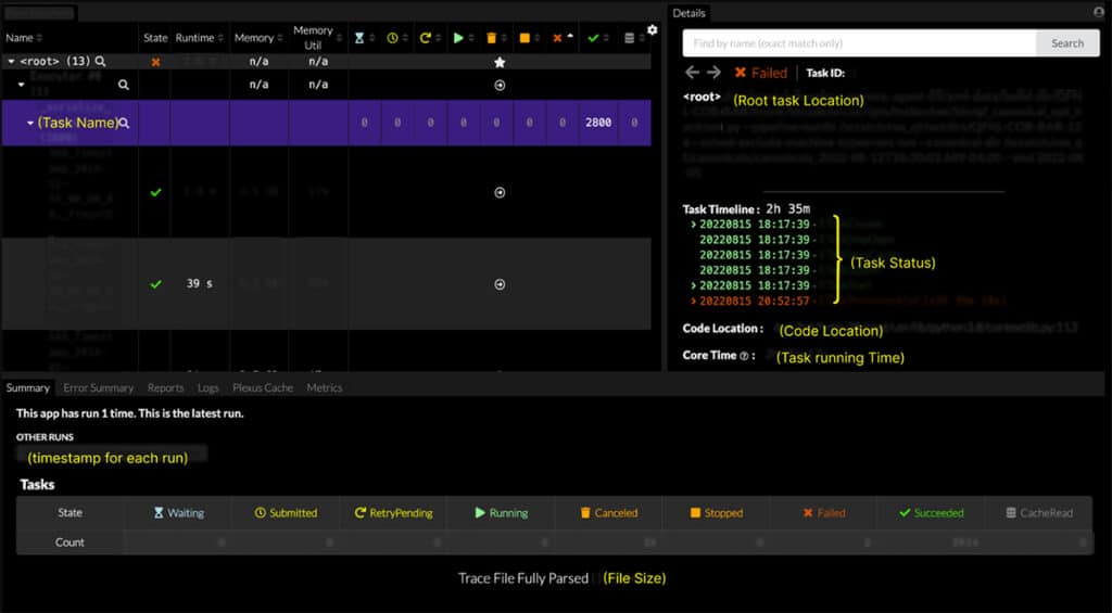
Prior to my work, the original UI looked like this:
To achieve user-centered layouts, I adopt the following principles throughout my design process:
Principle #1. Design with a deep understanding of user goals
Before a single line of code is written, fully understand what the users are trying to achieve, rather than simply implementing feature requests.
One of the benefits of UI development at HRT is sitting right next to my customers — the developers, programmers, and researchers using my tools. Unlike B2C companies, who rely on competitive analysis, market studies, and user personas to gather customer insight, my understanding of my user base comes from direct and ongoing conversations with peers. After conducting interviews with a cross-section of users, I came to two conclusions:
- Too many tabs made it difficult to find features.
- Screens were built as a stack of features based on a list of user requests.
As a result, workflows didn’t follow the user’s mental model, which meant that only 20% of features were actually being used.
For example, even though the same information was available in the Task Watcher UI, users would use the old terminal interface to view the error summary because they weren’t aware it was hidden away in a tab at the bottom.
One technique I used to figure this out was card sorting, which lets me visualize how all of the features fall into different categories in the user’s mental model. In the following example, there are 5 sub-tabs (Summary, Error, Report, Log, and Plexus) and over 80 fields. During my interviews with users, very few actually knew what these fields were for.
After running some task analysis, we discovered users had three goals: (1) Monitor activities, (2) Find errors, (3) Debug.
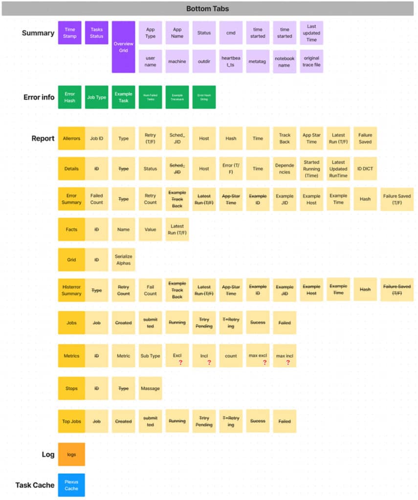
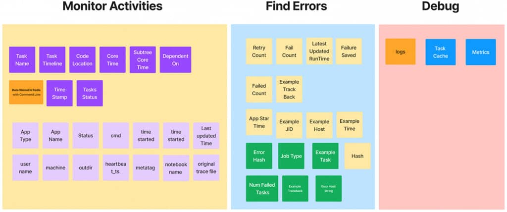
During my interviews with users, this technique guided my exploration of which existing features users were familiar with and helped me identify why they used (or did not use) any of them.
Principle #2. Tailored controls are key to making actions faster
When I design, I think through scenarios for the most heavily used controls to determine best practices.
In Task Watcher, it was common for users to manually monitor runtimes to find problematic or slow tasks. This was laborious and error-prone. The new UI includes a screen that has a visual display of task runtimes, highlighting outliers so problematic tasks can be easily found.


Principle #3. Establish a design system to ensure visual consistency
Standardizing design language also helps me build a seamless trading experience across multiple UIs and multiple parts of a single UI. In addition, consistency makes it easier for users to understand and navigate the interface.
When features are added without regard for an existing design system, developers have to make choices that don’t necessarily improve the user experience. For example, the previous design used green text to indicate success, which made sense in isolation, but it was hard to read against some of the existing background colors. There are many tools online that can help you decide if certain color combinations result in readable text. We use the Color Contrast Checker from Coolors. Creating a complete design system allows us to think through features in aggregate, ensuring that everything remains readable.
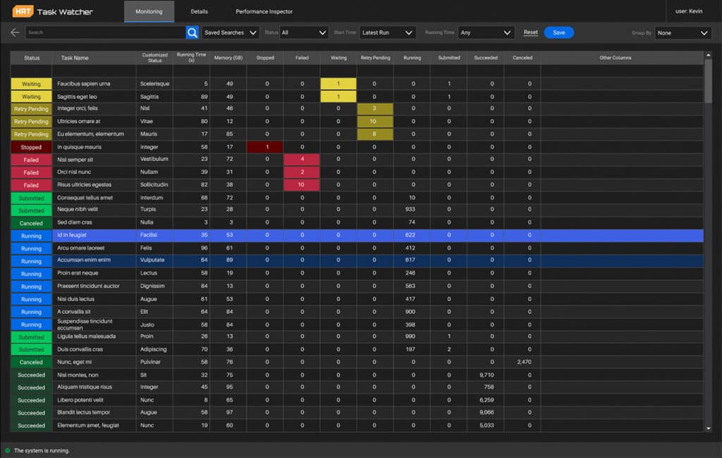
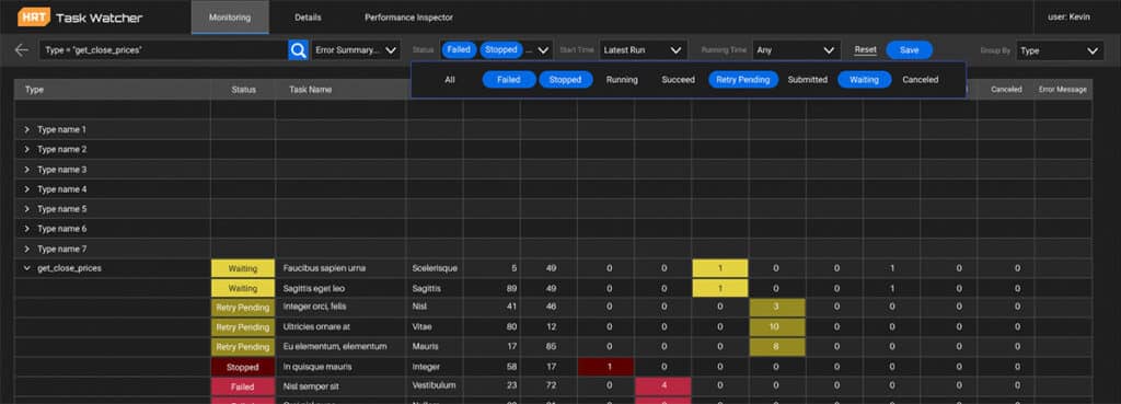
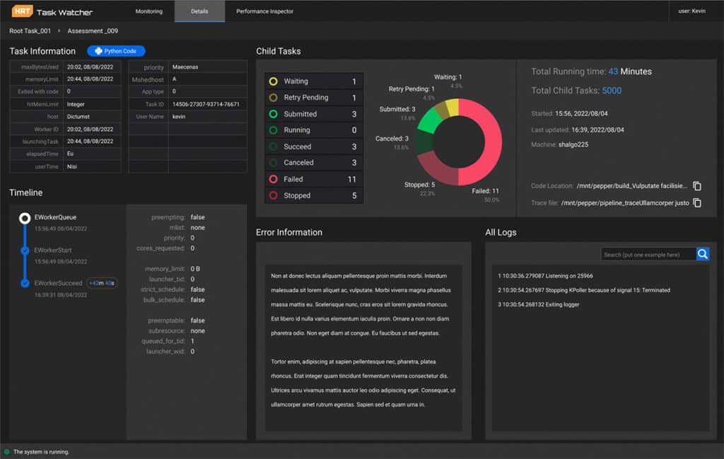
For Task Watcher, I designed a dark theme template with specifically chosen colors for each type of task progress or category of information.
Redesigned monitoring screen:
Redesigned detail screen:
Principle #4. Continuously gather and incorporate user feedback.
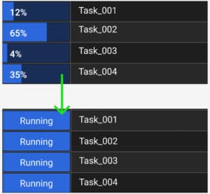
As I roll out new designs, I continue to collect real-time feedback from users to address early roadblocks. Working in close proximity to my user base enables me to troubleshoot issues as soon as they are identified and implement solutions under quick turnaround times. The design process for Task Watcherwas continually iterated on and modified according to user feedback or technical limitations.
For example, the display for currently running tasks initially included a progress bar. However, we realized that it wasn’t possible for every type of task to report its progress, so we eliminated this feature from the display.
Conclusion
As HRT embraces increasingly complex user interactions, we must prioritize an efficient design process that begins with a dialogue with our users. This starts with my comprehensive understanding of their thought process in order to distill lists of requirements into an essential UX that reflects the user’s real intent, whether that’s monitoring a complex distributed task tree, monitoring complex risk metrics, or executing critical trades. When I first face a new UX, the complexity can be intimidating, but by applying UX fundamentals and spending a lot of time with my users, I’m able to achieve results I’m proud of that improve our work as a firm.
